


Naledi Thabo’s Business Model — Turning Beauty Into a Multi-Layer Creative Economy
From nail artistry and celebrity beauty services to team-driven studio systems and wig retail expansion — how Naledi Thabo is building a layered, culture-led beauty ecosystem that scales beyond the salon.
How KaeB Turns Funk, Jazz, and Deep House Into a Warm, Layered Stay Cozy Universe Built for Late Nights and Long Replays
The Stay Cozy architect blends funk, house, and soulful experimentation into a deeply textured EP that listeners are already calling timeless
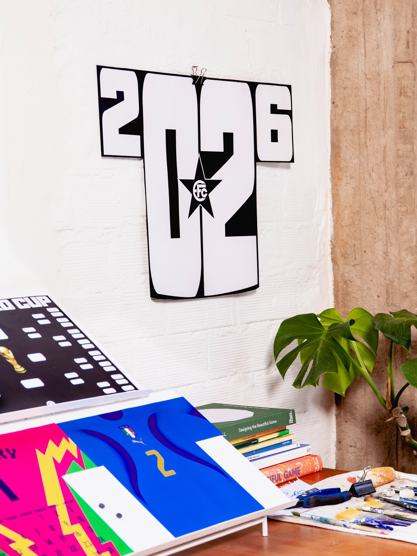
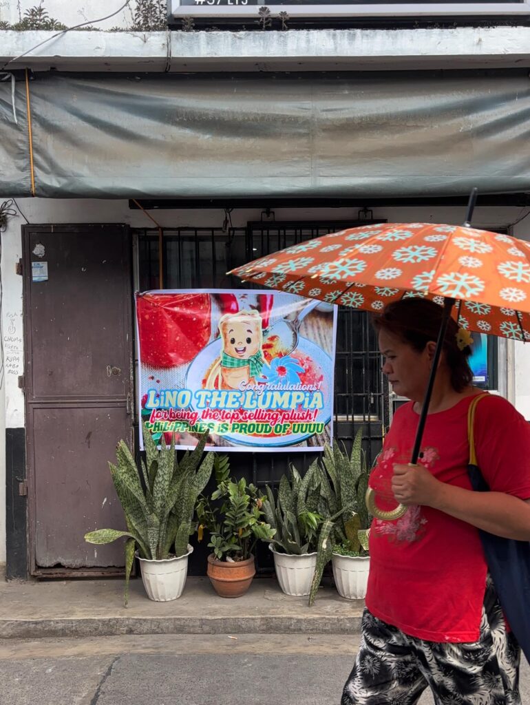
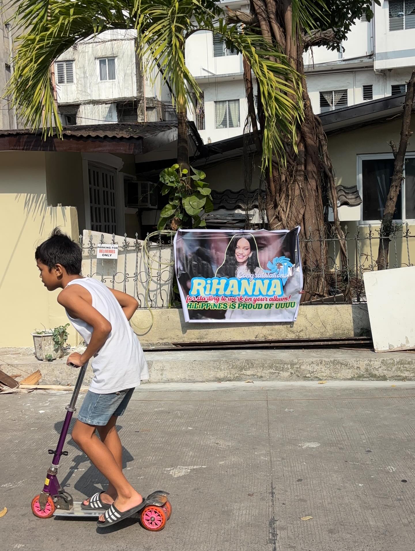
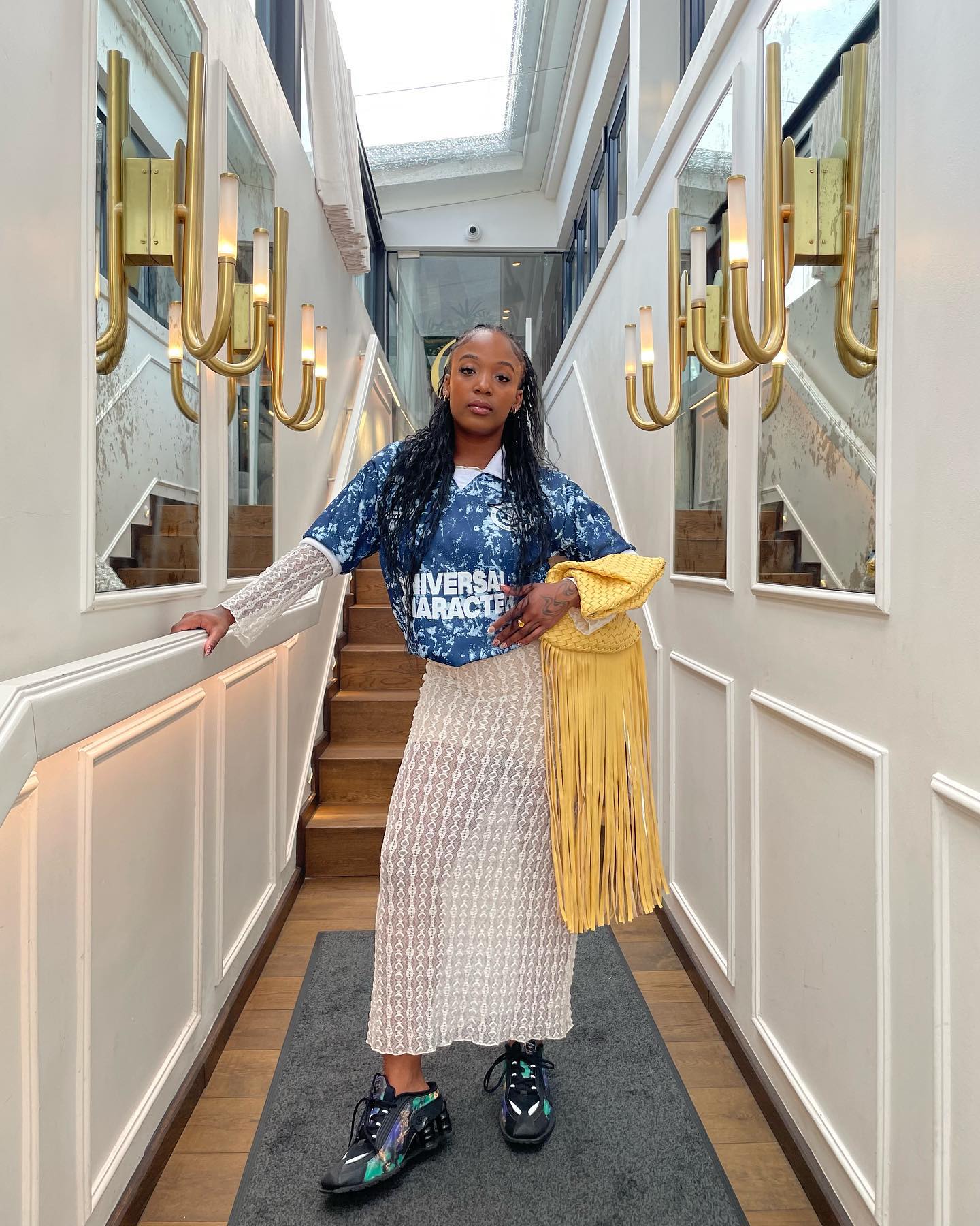
Equipo FC: The Football Nerds Who Turned Old Jerseys Into Cultural Currency
The Beginning: When Football Shirts Stopped Being Just Football Shirts
BB.Faith is Whatever She Wants It 2 BB
What Ideas Agency HOME WORK MAG CONTACT PATTA-From Dope Recognition to Global Cultural Institution BB.Faith is Whatever She Wants It 2 BB ggghh kkkkklll hkhkhh ncnnnfnfnf khkhkhkh fjfjfjfjf mfmfmfm Edit Template Courtesy of bb.faith (Copyright © bb.faith, 2026) BB.Faith is Whatever She Wants It 2 B
Khanyicam: The Quiet Architect of Community-Driven Visual Culture
How a multidisciplinary creative is documenting, shaping, and connecting South Africa’s emerging youth scene
Tandaza Simama: Curating Culture Through Thrift and Style
The illustrator’s colour-drenched landscapes are an iterative and experimental play on “the tension between flatness and texture”.
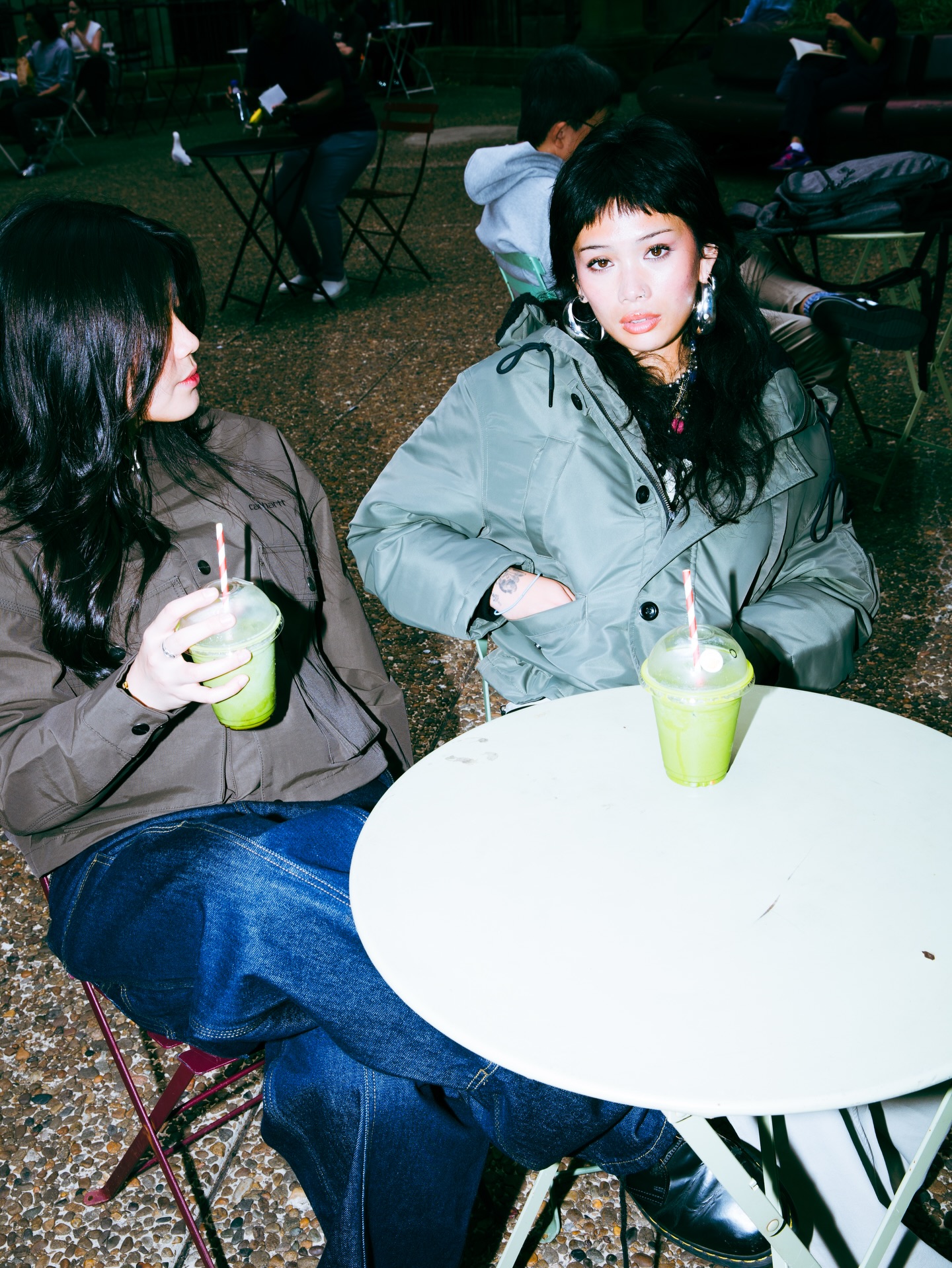
Why Carhartt WIP Australia Feels Like a Streetwear Power Plant Disguised as a Clothing Store
A closer look at how design, lighting, activations, and pure aesthetic discipline turn Carhartt’s Australian presence into something that feels less like retail and more like cultural infrastructure
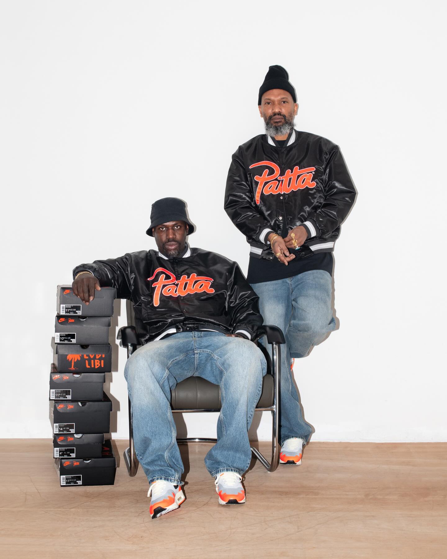
PATTA-From Dope Recognition to Global Cultural Institution
PATTA-From Dope Recognition to Global Cultural Institution
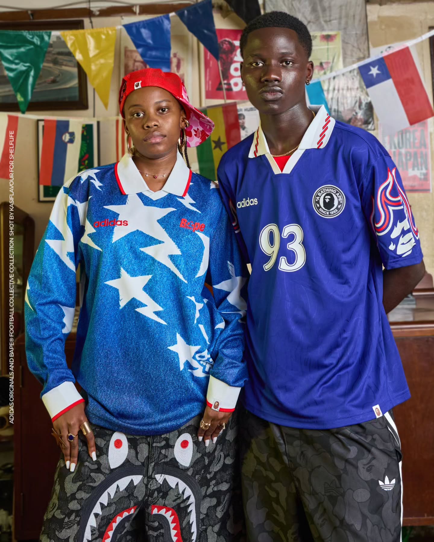
How Shelflife, Sister Bozza, and a Collective of Local Creatives Reframed a Global Streetwear
A deep look into how Shelflife’s South African campaign for the BAPE x adidas collaboration, photographed by Sister Bozza and shaped by a wider network of local stylists, models, and cultural contributors, transformed a global streetwear release into a grounded visual narrative rooted in township